Show Us the Data
(First published March 15, 2022)
PoPNB has been asking for data supporting the New Brunswick Government's decision to lift all Covid protections. It has been continually denied.
Yesterday (March 14, 2022), Jennifer Russell spoke to CBC about this. Let's look a little more closely at what she and the Department of Health spokesperson said.
CBC points out (similar to how PoPNB has) that the metrics currently cited as supporting the removal of all protections, are comparable to or worse than the metrics used to put New Brunswick in a 16 day lockdown only 56 days ago.
"But modelling shows the province has passed the peak of the Omicron variant, said Russell. 'Yes, we do have a continued level of hospitalizations, but we're managing' she said."
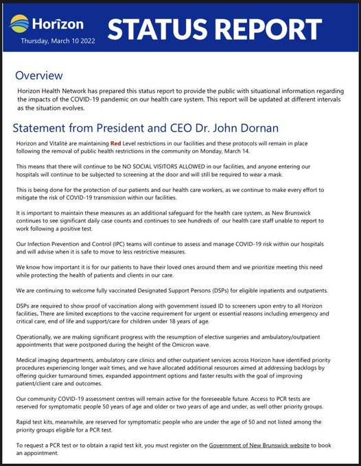
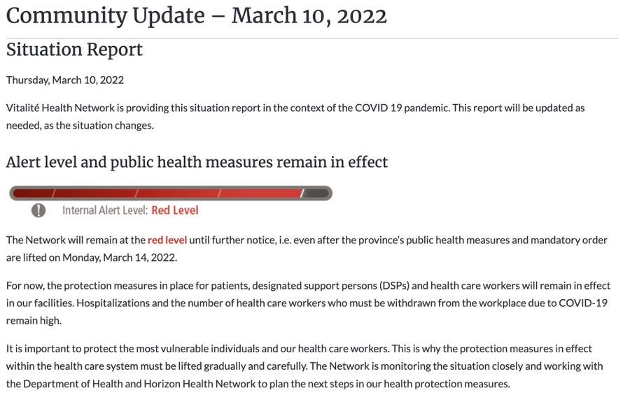
Both RHAs are still in RED status. Calling this level of stress "managing" suggests room to breathe.
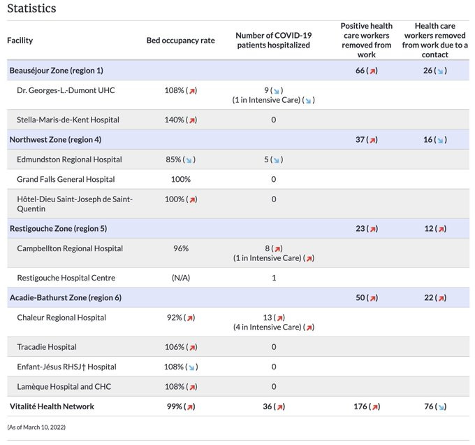
In actuality, many hospitals, especially in the Vitalité network, are stressed well above 100% capacity.
"'We are well equipped to move to the next phase of our pandemic journey,' she has said, citing high vaccination rates."
Between Jan 14 when we were shocked into a lockdown and now, vaccination rates have largely stalled.
Is 50% boosted "well equipped"...?
CBC brought up the public requests for transparency and access to supporting information in light of what is deemed a premature lifting of protections by both Public Health Agency of Canada and Canadian paediatric associations.
CBC News requested the latest modelling but DoH spokesperson Bruce Macfarlane said only: "Our latest modelling predictions … indicate a steady decline in hospitalizations, ICU admissions and deaths from mid-February."
Let's look at this.
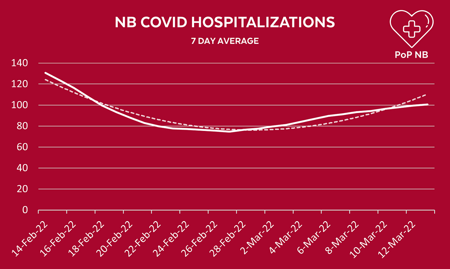
Between "mid-February" (Feb 14) and today, hospitalizations, ICU admissions and deaths are all trending up. I find it difficult to believe we have different definitions of "steady decline." At the very least a PR spokesperson would be explicitly aware of public interpretation.
So is this just a lie? Why would PH make such a bold statement they knew could easily be disproven?
I have come to not underestimate the boundless hubris of this government. They can say anything, true or false, and comfortably expect the public to accept it at face value.
They are aware the overwhelming majority of New Brunswickers will not question their fabricated rationale. For those of us angry enough to point fingers, make graphs, and ask questions, they've got controls coming.
They're burying the data.
To control a narrative, one must control the information surrounding it. Let's look at how to lie with statistics.
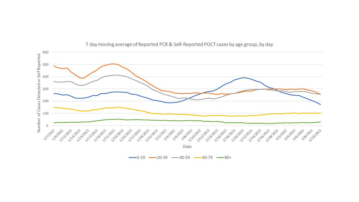
The only numeric data offered by the Department of Health spokesperson was this colourful piece of art in which PCR and POCT cases are broken down (overlapped) by age cohort.
What story does the supplied graph tell?
Look at that green line which is almost zero. That must be good.
Deception: The green line represents the roughly 5% of NB pop. over 80. Despite this, the graph shows cases in this age group represent roughly 10% of the total.
Look at that blue line, it's going WAY down. That must be good.
Deception: The blue line represents kids <19. In the last 3 weeks parents have been increasingly told not to report their covid + kids. This graph also omits the 10k+ cases occurring in schools during this period.
But all the lines are down under 300 now. That must be good.
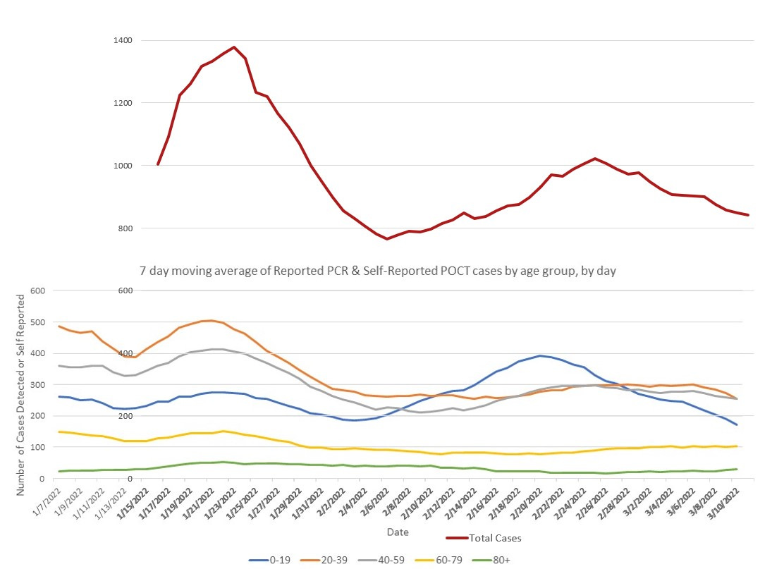
The largest and most egregious deception of this graph is the overlapping of case volume. Lines that hug the horizontal axis are, after all, more favourable. This is a conscious choice to misrepresent the data.
A plot of the true total of these cohorts on the same scale and over top of Public Health's graph is below. The true picture illustrates the true toll, and the true depth of the pandemic present over the last weeks and today. We are still well over 800 case per day (that we know about).
As protections and restrictions lift, the implication of Covid being a “don't-sweat-it” disease will result in even more underreporting of cases. Fewer people will log positive results. Fewer people will even bother to test. And the numbers in this graph are already underestimates.
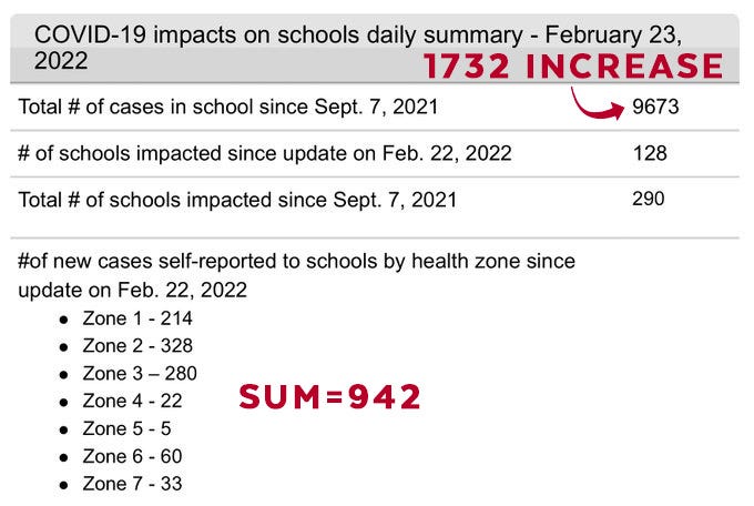
The Public Health graph also omits most of the 10K cases reported to EECD over the same time frame. We know that parents were asked to report to schools and GNB, however we can show this did not happen. We may never know how many juvenile cases were captured in both the EECD and GNB numbers.
We know that the EECD numbers are subject to some strange math. Summing the new cases (broken out by districts) almost never equalled the change in total cases reported the same day. Some days this was off by as much as 145%. Which number was correct? Why weren't these counted?
There is verisimilitude in pretty pictures and confident statements suggesting that data supports the narrative of lifting of New Brunswick protections.
None of this stands up to even modest scrutiny.
So we say again. Show us the data.
We want to be wrong.


